Word documents are the backbone of many ASTHO deliverables, from notes and outlines to a CB product’s finished PDF, which is why using best practices is so important for accessibility. The good news is that some of these are tools you’re already using regularly, and others are just simple tweaks to existing routines.
Use the Styles to Create a Logical Structure
Use the Styles to Create a Logical Structure
The biggest step you can make toward accessible Word documents is using the styles consistently and correctly. Styles are a feature of Microsoft Word that define the visual appearance of a document. In technical terms, they’re a series of formatting instructions that make it easy to keep your document consistent. In practical terms, they are the quickest way to set up a logical structure for your content, which is critical for people who use assistive technology (AT). A logical structure gives those users the same benefit as a sighted user who is skimming the page and using text size and other clues to get a sense of how the content is organized and what’s important.
How to Find Your Document's Styles
There are a couple of ways to access your document’s styles. The first is in the Ribbon at the top of your document. The group between Paragraph and Editing is home to an abbreviated Styles selection. If you scroll through, you can access the normal font, header levels, and both ordered and unordered lists, among other things.
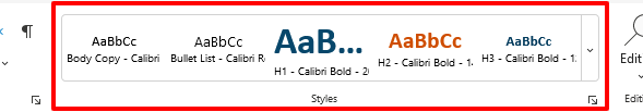
You can use the full Styles pane to review additional available styles. Access that by selecting the small square with an arrow in the corner of the Styles group in the Ribbon. A full pane will populate on the right side of the screen. You can use either the Ribbon or the Pane to select which style you would like to use.
You can also toggle the Styles pane on and off using your keyboard:
- In Windows, use Shift + Control + Alt + S
- On a Mac, use Shift + Command + Option + S
Headers: Order and Use
Of the heading levels that Word automatically offers, it is considered best practice to only use the first six (H1-H6). Think of these as levels of an outline. H1 is equivalent to the title and should only be used once, H2 is a section header, H3 is a subsection header, and so on. It is important that you use heading levels in order and do not skip any of them. The difference between levels may seem purely aesthetic, but they are in fact the structure of your document, and the map that a screen reader will use to navigate your content.
Headers: Navigation
Using headers correctly also translates into a precise table of contents. Word can use the heading structure to automatically generate a table of contents (use the Table of Contents option in the References tab). If you skip levels for aesthetic reasons, you’ll end up making your table of contents less accurate.
Word has an easy tool that will let you check how you have deployed your headers — the Navigation Pane. Access it in the Show section of the View tab. Selecting the box by Navigation Pane will call up a pane on the left side of the screen that will use your headers to give you an outline of the document.
Tables
Tables
Tables and graphs can be difficult for users who need assistive technology or who have cognitive difficulties. It is important to take these things into account when creating tables in Word. Fortunately, Word has several features that help make tables more accessible.
Add Titles, Captions, and Summaries
By giving each table (or graph, chart, or figure) a name and a number, you are making it easier for all your users to connect the table to the text that references it.
Word has a captioning function in the References tab. This built-in feature can also be used to create an appendix of tables, charts, etc., much in the same way that headers are used when creating a table of contents. You can also access Insert Caption from the context menu (i.e., the right-click menu).
Please note that it is important to maintain a consistent naming convention. For example, don’t label your first table as Table 1 and then your second table as Figure 2. Word does its best to help keep things straight — if you are using the Insert Caption function then Word will generate the correct number for whichever label you specify.
Remember that simply numbering your tables and images is not enough, it is still important to name each of them. Ideally using the Insert Caption tool.
Keep the Structure Simple
Table data is linearized by assistive technology: it is processed top to bottom, left to right, one cell at a time. Because of this, it is helpful to try and limit a table to a single page, and avoid merging cells whenever possible, as that can create problems for users who rely on screen readers.
Specify the Table Header
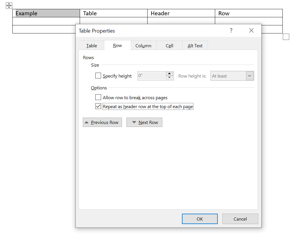
If your table is just too large for one page, it will be important to set the table header. A table header guarantees that the header row will automatically show up on each page. It also has the added benefit of creating consistency for assistive technology — even if the table stays on one page, AT will be able to identify header cells for users.
To Specify a Header on an Existing Table from the Ribbon
- Right-click in the row(s) that you want to repeat on each page.
- Select Table Properties from the context menu.
- Select the Row tab.
- Select the check box next to “Repeat as header row at the top each page.”
- Select OK.
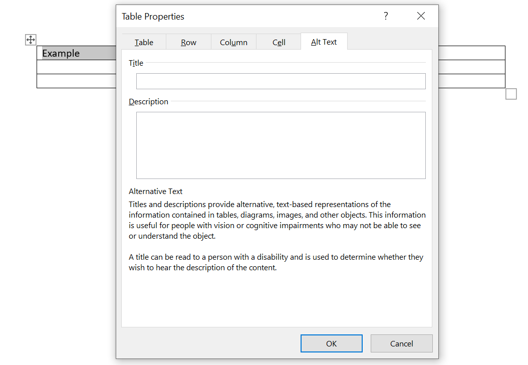
Alt Text for Tables
Alt text isn’t limited to images, it’s also an important part of making tables and graphs accessible. You can use the alt text to explain how the table’s content is organized or summarize the findings in a graph.
To Add or Edit the Alt Text
- Right-click on the table and select Table Properties from the context menu.
- Select the Alt Text tab.
- Enter the alt text in the description field. You should use this space to describe the contents briefly, there is no need to rehash what the table data says.
Images
Images
It is important to make a distinction between informative images and decorative images, such as borders and flourishes. Decorative images can be marked as such in the alt text (there is a checkbox in the alt text pane) and will be skipped over by assistive technology (AT). Because decorative images are not registered by AT, the rules about placement are less stringent. However, when inserting informative images, it is important to follow best practices. This means adding alt text, including image captions, and placing images in line with the text of the document (rather than in the “graphics layer” where screen readers may miss it).
Placing an Image In-Line with Text
- Insert the image into the document at the desired location.
- Right-click on the image and select the Wrap Text option.
- Select "In Line with Text" from the Wrap Text menu.
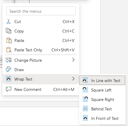
“In line with text” is the only option that places images in the same layer as the text, which makes it more visible to AT. The text may shift once the image has been put in place. If it does, you may have to cut and paste the text around the image to put it back where it belongs.
Document Properties
Document Properties
Updating a document’s properties allows you to add specific metadata to a document. This is useful context for AT-users when they search for or open a document.
Adding or Updating Document Properties
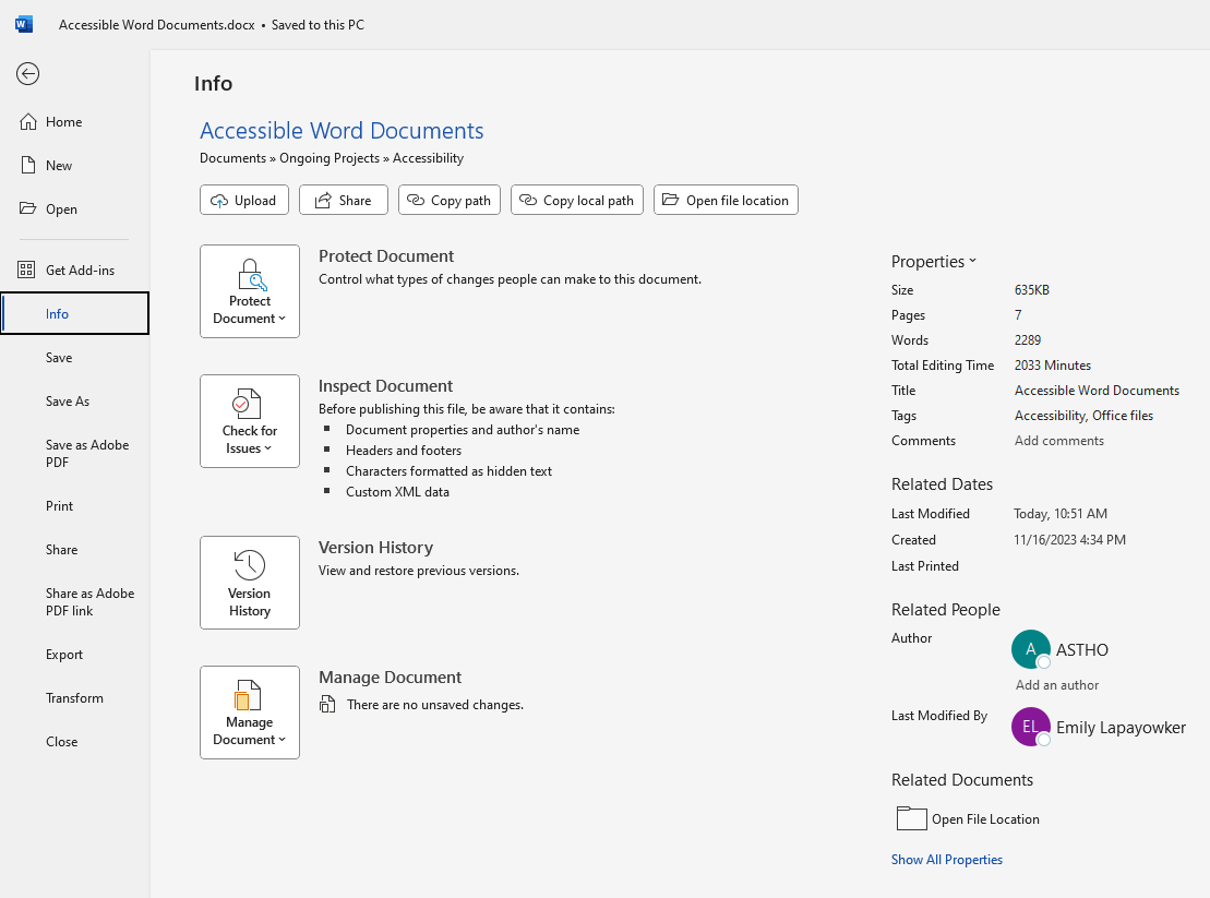
- Select File, then select Info.
- Update the properties listed in the right column.
Key Information to Add
You may fill in as many of the categories as you would like, but the three most important are:
- Title
- Author (should be ASTHO)
- Tags (i.e., keywords)
Accessibility Checker
Accessibility Checker
The best way to make sure your document is accessible is to follow best practices. Any checking technology you use starts from that point and assumes that you have already tried your best to institute best practices. That said, accessibility checkers can be a useful tool and can help you identify areas you may have missed.
All Microsoft Office programs have a built-in accessibility checker. Some of the common checks it performs are:
- Use of heading styles.
- Missing alt text.
- Unclear link text.
- Table header information.
- Blank rows or columns in a table.
Accessing the Office Accessibility Checker
- Select File, then Info.
- Select Check for Issues under Check the Document.
- Select Check Accessibility.
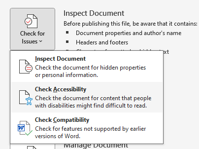
An accessibility pane will appear to the right of your document. The inspection results will appear there.
Checkers Are a Starting Point
Please keep in mind that accessibility checkers are not omnipotent. For example, the checker can tell you if you have forgotten to include alt text for an image or table, but it cannot evaluate the quality of your input. If you use “image” as the alt text for every single table and picture in your document, you will have created all kinds of headaches for AT-users but will not trip any of the Office accessibility checker’s alarms.
Review Other Available Resources
Review Other Available Resources
No accessibility efforts happen in a vacuum. Many of the subjects covered in Tips & Tricks: Improving Digital Accessibility are relevant to Word documents, as well. Revisit that resource to review the finer points of best practice for alt text, linking, and color contrast.
Once the file is ready, review the Accessible PDFs resource to learn best practices for turning your final Word document into a more accessible PDF.
Help Us Improve the Accessibility Hub
Do you have 2 minutes to help us improve these accessibility resources?